#CommutesCount by Strava: MORE DATA-DRIVEN BICYCLE AND PEDESTRIAN PLANNING

In the United States May is National Bike Month. The tradition that started in 1956 by the League of American Bicyclists as a way to “showcase the many benefits of bicycling — and encourage more folks to giving biking a try.” Across the country cities are hosting various events throughout May to promote Bike Month. The pinnacle event of this month long celebration is without a doubt “Bike to Work Day.” Here in Seattle, Bike to Work Day is actually “Bike Everywhere Day” and falls on May 20th.

But what if your city doesn’t have an organized Bike to Work Day or if your country doesn’t observe Bike Month? Strava, the excellent cycling, running, and [various other] activities tracker app, has come up with a unique solution that is uniting cyclists around the globe and providing valuable data that can be used to improve urban infrastructure for cyclists and pedestrians.

If you are a Strava member you can join the Global Bike to Work Day challenge Strava has organized. To complete the challenge all they ask is to upload a ride on May 10th that starts in one place and ends in another. If you're not a Strava member don't worry. You can signup for a free account here. The challenge is simple enough and the impact could be huge. 

In 2014, Strava launched a data service called Strava Metro. The mission of Strava Metro is to anonymize and analyze the trillions of data points it collects from the “more than five million rides and runs uploaded to Strava each week.” In cities, the majority of these activities are commutes so these data points can provide “ground truth” on where people actually ride, run, and walk in cities.

Strava is taking a data-driven approach to make cities more bikeable and safer for pedestrians.You might remember that I shared my experience assisting the Washington State Bicycle and Pedestrian Documentation Project who is also working toward this same goal. You can read more about that here.

With May just a few days away and Strava’s Global Bike to Work Day challenge just around the corner you still have time to join Strava and participate in the challenge. By doing so you personally can help make a difference. Find out more about Global Bike to Work Day on their blog. I also encourage you to find and participate in any Bike Month activities in your area. 

See you out there.

#CommutesCount #bikeseattle

NOTICING UNNOTICED DESIGN

As I alluded to in (one of) my first posts, I care about design. And as I said then, this is a huge statement in itself. But I'm hoping to unpack it from the perspective of a small design podcast called 99% Invisible

In the late summer of 2013 I spent an average of three hours commuting to and from work every day. To pass this time I filled my ears with podcasts like This American Life and Radiolab. On one of these commutes I was catching up on the backlog of Radiolab episodes and began listening to one entitled “Radiolab Presents: 99% Invisible.” The host Roman Mars described the show as a “tiny radio program about design and architecture and all the thought that goes into the things that people don’t think about.” I was instantly intrigued and after listening to this introductory episode I was hooked.  

Roman Mars. photo by Bert Johnson

I proceeded to download the nearly 90 episodes of the podcast and filled my commute with the beautifully created audio stories of the innovative design solutions all around us. As Mars eludes to in his introduction, his podcast has helped me notice more of the designed world around me and continues to spark my passion to design great user experiences (or solutions). As a quick aside, last March Mars gave an amazing TED talk about good design from the perspective of vexillology. I highly recommend you watch it. In it Mars reveals the five basic principles of flag design and shows why he believes they can be applied to just about anything.

Mars and his amazing team have now created over 200 episodes and most recently, they have added written pieces as well as a short video collaboration with Vox exploring the concept of Norman Doors

While I encourage you to listen to all the episodes of 99% Invisible let me direct you to a handful of my favorites.

Episode 52 : Galloping Gertie - The story the original Tacoma Narrows Bridge. It used to dance in the wind.

Episode 86 : Reversal of Fortune - The story of reversing the flow of the Chicago River. Yup, they reversed a river.

Episode 110 : Structural Integrity - The story of how a 59-story skyscraper was built with a potentially fatal flaw and how an architecture student discovered the problem. Spoiler: it didn’t collapse because they fixed it in secret.

Episode 197 : Fish Canon - The Story of wildlife corridors and designing solutions to get salmon around the nearly “88,000 water flow barriers in the country.” Yes, it’s a cannon that shoots fish!

Episode 156 : Coin Check - The story of a unique way “to show appreciation, love, sympathy, or professional connection.” And it makes a fun drinking game.

Last fall the 99PI team challenged it’s listeners to become sustaining members of the podcast network Radiotopia, of which 99% Invisible is one of its founding podcasts. It was a no-brainer for me to support 99PI and the other fantastic podcasts of Radiotopia. And to make the deal even sweeter, for being a supporting member I received a 99PI challenge coin that I now carry with great pride. 

Now, head over to 99percentinvisible.org and enjoy. I suggest you start at episode one

Wait, one last thing. If you have a podcast, book, movie, or something that has impacted how you see the world please share it by leaving a comment below. And, if you’re already a fan of 99PI, what’s your favorite episode?

THE CUSTOMER IS ALWAYS RIGHT or THEY CAN TEACH YOU WHAT IS RIGHT

Growing up I remember seeing a wooden plaque on my dad’s desk that read something like, “Rule #1 The customer is always right. Rule #2 If the customer is wrong, refer to Rule #1.” This is the crucial starting point for designing great experiences. 

Products, services, or experiences must be designed with the customer's needs as an essential part of the design process. IDEO is a design firm that takes on this “human-centered, design-based approach.”

Human-centered design process outlined by IDEO.

In his blog post for User Testing, Spencer Lanoue outlines the two key empathetic methods IDEO uses to discover the end user’s needs during the inspiration phase.

  • Observing user behavior — Try to understand people through observing them. For example, if you’re designing a vacuum cleaner, watch people vacuum.
  • Putting yourself in the situation of the end-user — IDEO does this to understand what the user experience is really like; to feel what their users feel.

Many have lost site of this principle and are losing customers to companies who are designing with the user in mind. Sunrise, a calendar app started with this in mind when they set out to “solve some of the problems with calendars they heard from users”:

1. “Today’s calendar feels quite stale”
2. “My calendar takes forever to synchronize properly”
3. “Timezone support is a pain”

Dissatisfied with the stock Apple Calendar app I sought out a calendar app that would solve the problems I was encountering. Sunrise was the solution. After reaching out to Sunrise with a few improvements I thought could further enhance their app they invited me to their beta program and sought my feedback. Additionally, I participated in a one-on-one interview with one of Sunrise’s product managers who's desire was to know more about how I used the app and its services. And lastly, I was invited to participate in a secret project for a feature so new it wasn’t even in the beta app. 

A quick comparison between apps. Both a "days" view and "items" view split but Apple only show events for the date selected. Sunrise shows just two weeks of the "days" view to prioritize the events, not only of the date selected, but also for the following several days. Additionally, Sunrise adds pops of color and icons, which correlate to the type of event, to make the calendar less stale. 

Sunrise took the time and made the effort to discover and understand its user’s needs. 

In February of 2015 Microsoft acquired Sunrise and in October of 2015 Microsoft officially shut down the Sunrise app. When I reached out to my contact regarding the shutdown she told me “the team has moved on to revamp the Outlook app for iOS and Android.” Additionally, in their farewell post the Sunrise team promised: “We won’t stop innovating. While building Sunrise, we were always learning from and listening to you to come up with ways to delight you and make you more productive.” 

Remember, the customer is always right or listen, observe, and empathize and they can teach you what is right

EVERYDAY UX: USING SPOTIFY

Last summer Apple introduced its streaming music service Apple Music and, for me at least, it initiated the final push over to streaming music. My wife had already jumped on the Spotify bandwagon but I felt like giving Apple Music a try especially since they had a 3-month free trial. While Apple Music had it’s nice features in the end I chose to join Spotify because of its social features like seeing what your friends are listening to and creating public (and private) playlists.

connected devices 1 (mobile).PNG

In my first four months of using Spotify I’ve enjoyed some great features and experienced a few pain points. I’ll highlight a few and I’d love to hear about your experiences as well so leave a comment after you’re done reading.

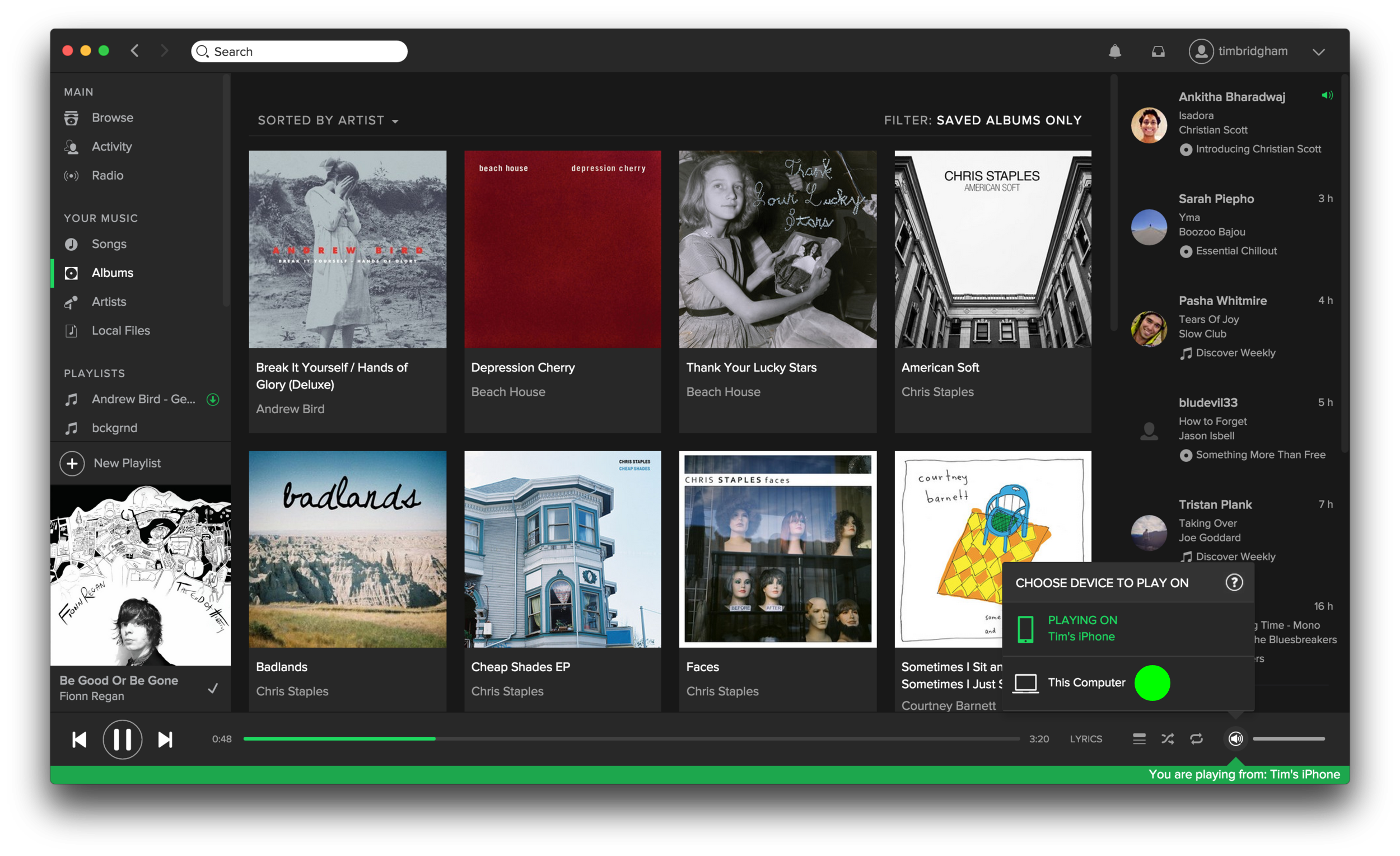
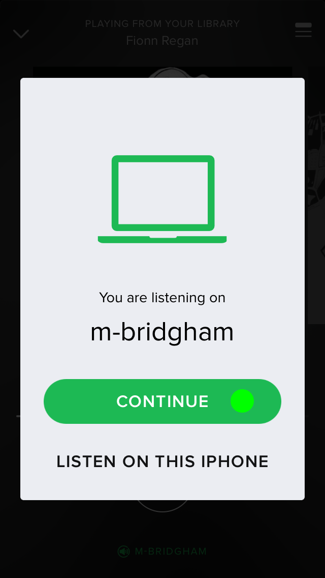
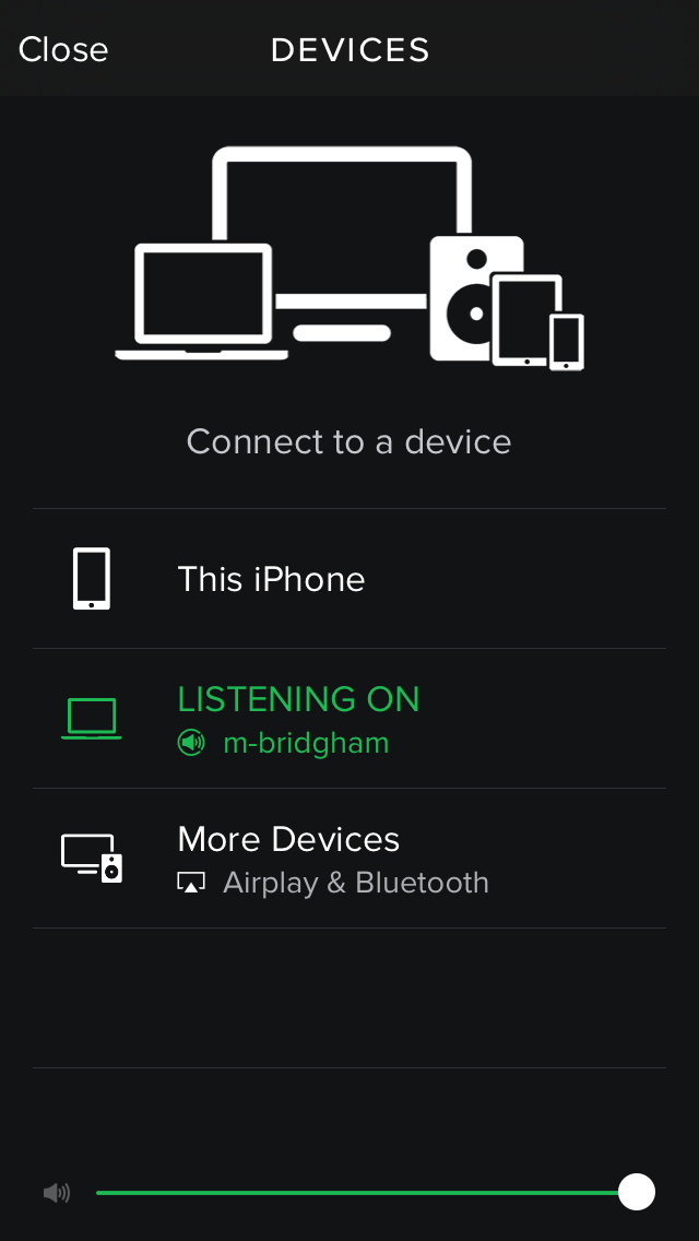
First, the good. Spotify’s ability to connect to other devices has been nothing short of amazing. I have seen iTunes talk to my Apple TV but Spotify’s seamless connection between my phone, desktop application, and Apple TV is superb.

While playing a song in Spotify on my iPhone the desktop app shows me that I’m currently playing music from my phone and even gives real-time feedback as to where I am in the song. I can easily switch to playing the song from my computer with a few clicks on my computer and a few taps on my phone. The process is simple, straightforward, and perfect for controlling the music in the living from from your kitchen.

Second, the not-so-good. Spotify has many ways to enjoy the over 30 million songs it has. You can search for a specific song, artist, album, playlist, and more. Or you can browse curated playlists, the latest charts, new releases, and even more. There’s even a radio feature similar to Pandora. And lastly, you can manage your own library of saved playlists, songs, albums, artists, and still more. With all these great ways to experience content it is crucial that the information architecture or layout of each of these sections be optimal.

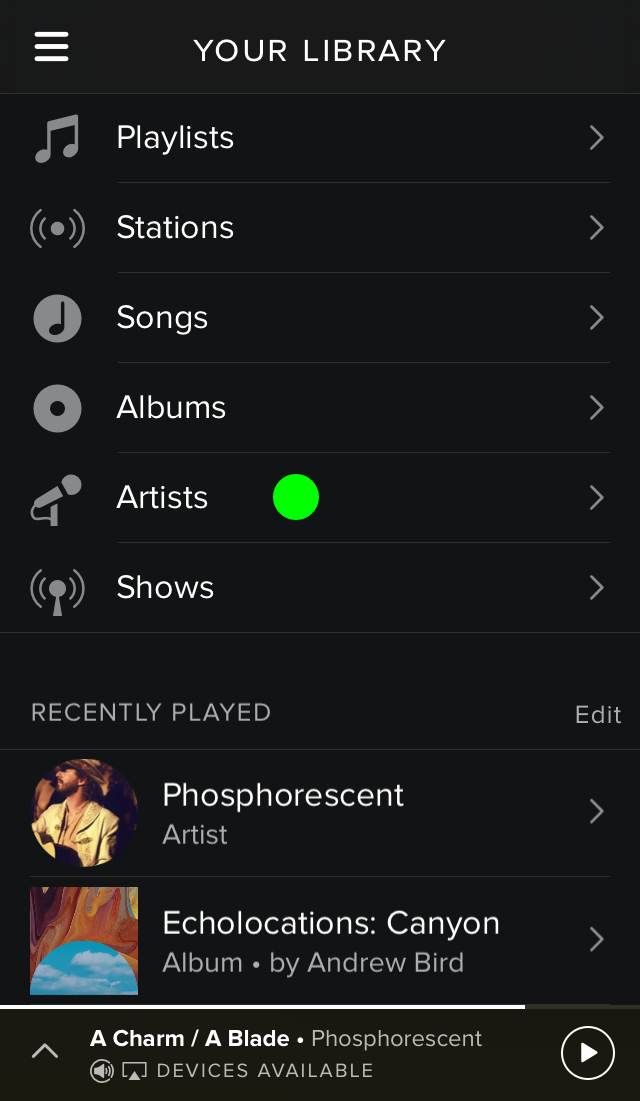
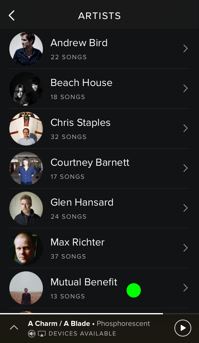
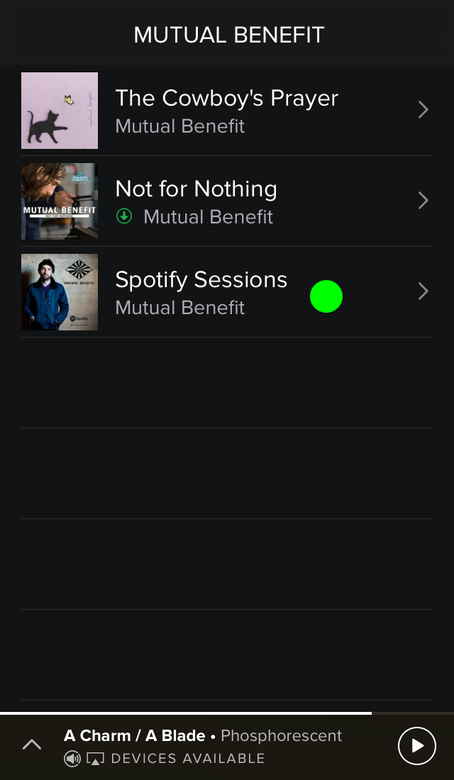
Current presentation of all music when selecting an artist to view.

Current presentation of all music when selecting an artist to view.

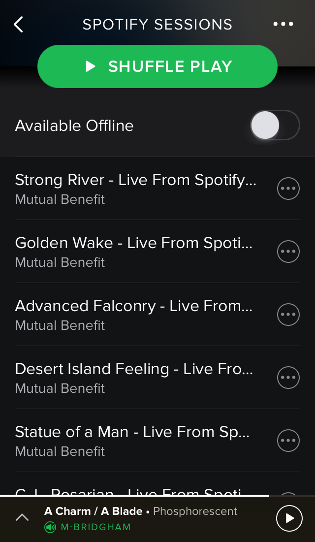
This is where I have an issue, particularly in the “Your Library” section. When I want to play an album, say the Spotify Sessions by Mutual Benefit, I have two ways in which I can get the album. The first would be to tap on the “Albums” section but then I am presented with a list of all the albums I’ve saved to my library (which can be sorted by artist or by album title). I’m then forced to scroll down to find the Spotify Sessions album I want to play. Secondly, I can tap on the “Artist” section and then tap on the artist Mutual Benefit but then I am presented with just a list of all the songs I’ve saved to my library. The songs are displayed in track order by album but there is no clear distinction between the end of one album and the start of the next. To make the process of selecting a specific album easier Spotify should present a list of the artist’s albums after you’ve selected a specific artist. This simple flow below illustrates the better experience I’ve proposed.

1. Tap Artists and present all artists saved to my library. 2. Tap Mutual Benefit and present all albums by Mutual Benefit saved to my library. 3. Tap Spotify Sessions and present the songs from that album (4).

Lastly, one (probably large) fix that could enhance Spotify for a small minority of users. According to the Pew Research Center, as of September 2014, 71% of online adults use Facebook so I know I’m in the minority as a young adult without a Facebook account. Because Spotify is highly integrated with Facebook this presents some headaches when using Spotify. Firstly, and more importantly, if a friend wants to follow me on Spotify they have to know my specific username and type the following in the search bar: “spotify:user:username” to find me. This hinders the social aspect that distinguishes Spotify from other streaming services. Secondly, and somewhat related, Spotify users whose accounts are not connected to Facebook cannot update their profile picture. This isn’t going to prevent me from using Spotify but more of a “nice feature to have.”

This has been my experience using Spotify and I know they come as a result of how I use the service. What has been your experience, either good or bad? Please leave a comment below.

USING DATA TO DRIVE CHANGE (ONE CYCLIST AT A TIME)

Last week I volunteered part of my day to the 2015 Bike/Pedestrian Count as a part of the Washington State Bicycle and Pedestrian Documentation Project. I chose to spend my time counting cyclists and pedestrians for two main reasons. Firstly, as a bike commuter, I want to see continued improvements made for non-traditional commuters in a city where congestion and traffic seems to be getting worse and worse. And secondly, I can get behind the approach in which WSDOT and the Cascade Bicycle Club are using to drive change: through the collection of data.

Sunrise at the intersection of the Duwamish Trail and the W. Seattle Bridge Trail.

Sunrise at the intersection of the Duwamish Trail and the W. Seattle Bridge Trail.

When I moved from Kansas City to Seattle just over two years ago it was clear to me that Seattle is a much more bike friendly town than Kansas City. This is partly due to the temperate climate of Seattle but, more importantly, it is due to political support and the work of organizations like the Cascade Bicycle Club to make Seattle a more 'bikeable' city through the Seattle Bicycle Master Plan. Commuting to work on my bicycle seemed like the obvious choice especially when my office provides bike storage and locker rooms. In 2014 I rode nearly 1120 miles on my bike and this year I’ve already surpassed that number.

When I learned that volunteers were needed to count cyclists as a part of the effort to make Seattle more 'bikeable' I knew I wanted to help. I was especially excited to learn more about why we would be counting commuters at key locations throughout the city. The Washington State Bicycle and Pedestrian Documentation Project is “an annual bicycle and pedestrian count taken at locations throughout Washington State in nearly 50 jurisdictions. Data collected from these counts will be used to monitor success in increasing bicycle and pedestrian travel as identified in the Washington State Bicycle Facilities and Pedestrian Walkways Plan while also providing critical data to support improvements to bicycle and pedestrian facilities.”

The key part of this project is that “counting bicyclists and pedestrians at specific locations will help us to more accurately estimate demand, measure the benefits of investments, and design our projects. This information will also help us target safety and mobility projects and improve our traffic models.”

I see the positive way in which data can drive good decision making everyday at the user experience firm where I work. Our goal is that the user research we do informs the designs we produce. I too feel that important decisions, including how to make Seattle more "bikeable", should be made with good supporting data. This concept, 'data-driven-decisions', is standing out as a key component to creating great user experiences. 

I hope the information I collected helps to make improvements for the fellow commuters in my neighborhood. So how are things looking?

Here are the numbers for the morning commute at the intersection where I counted since 2009:

2009 - 139 | 2010 - 123 | 2011 - 289 | 2012 - 258 | 2013 - 233 | 2014 - 315 | 2015 - 308

Cyclist counted at the intersection of the Duwamish Trail and the W. Seattle Bridge Trail from 2009 to 2015.

Cyclist counted at the intersection of the Duwamish Trail and the W. Seattle Bridge Trail from 2009 to 2015.

At least for my intersection, it looks like the numbers overall are trending up but I’ll leave it to the Washington State Bicycle and Pedestrian Documentation Project folks to really crunch the numbers.

Bike commuting back in May 2014. 

Bike commuting back in May 2014. 

#bikeseattle

EVERYDAY UX: THE BENEFITS OF UNIVERSAL USER EXPERIENCES

Over the past five years I’ve supported users with their technology questions, either as an IT professional or “that techie friend,” and one constant that remains is the usefulness of a universal user experience. Maintaining a consistent design, feel, and set of interactions across devices is at the heart of universal user experience. Think of accessing your bank via an ATM, a website, and a mobile app. The more closer correlated the experiences are at each of these places the better. This is so important in today’s culture of multiple devices and the desire to seamlessly shift between those devices.

Among the many upsides of universal user experiences, I’d like to showcase two practical examples that demonstrate the following benefits: improved user efficiency and decreased learning time for users.

My first example? The implementation of the Apple external trackpad over the mouse.

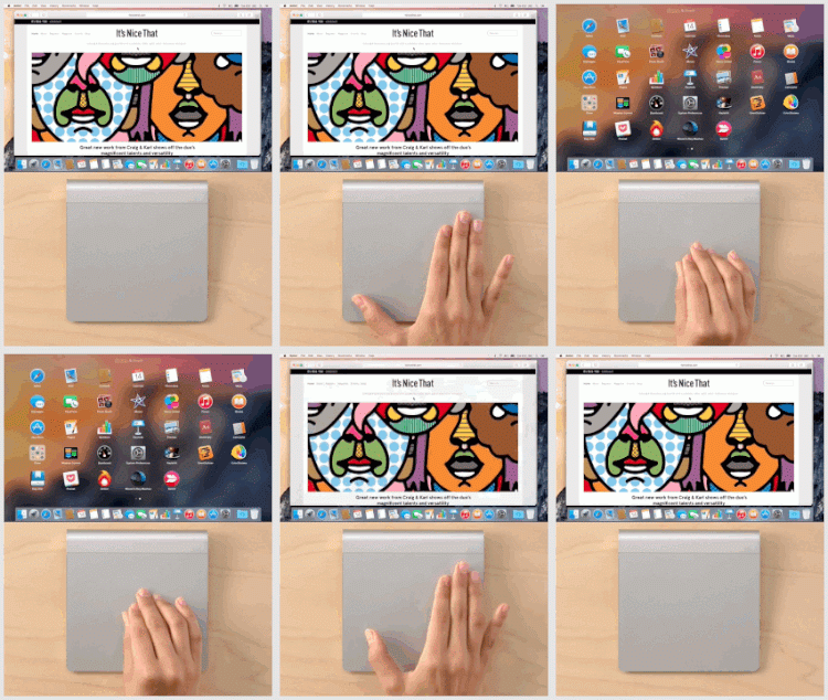
In 2010 Apple introduced the Magic Trackpad by essentially pulling the multi-touch trackpad out of its notebooks and setting it next to your external keyboard. Like most, I initially didn’t see the advantage of this over the well-established mouse, but since more and more multi-touch gestures have been added to OS X, the scales have tipped toward the trackpad. Learning the many gestures, which are conveniently shown in the trackpad’s system preferences, enables a user to take full advantage of all the operating system’s features. But when that user goes to an external mouse he or she must learn an additional set of gestures (that in my opinion are cumbersome to do on the mouse compared to the trackpad). Using the external trackpad is a natural extension of what the user already knows therefore eliminating extra learning time or confusion.

Apple's Magic Trackpad gestures for Launchpad, Mission Control, and Show Desktop.

My second example is the use of the Gmail web app over many alternative mail apps. This really breaks down into two parts: the experience of email on a computer and, closely related, the experience across devices.

I’ve been a Gmail user for close to ten years and I’ve always accessed my email via the web. Over the years Google has made incremental enhancements to the web experience and this is one reason I feel it is an improvement to traditional mail apps. Instead of infrequent, new application launches with large sweeping changes that can take time to find and learn, Gmail is able to roll out its new features with much more regularity. Additionally these new releases don’t cost the user any money and can often be turned off or tweaked to his or her liking.

Another reason I feel Gmail is superior to stand-alone mail apps is the fact your experience with Gmail doesn’t change from computer to computer. If you’re on a friend’s computer or at the library and need to access your email, the experience on the web is always the same. An Apple Mail user, for instance, would need to take time to learn how Gmail on the web works.

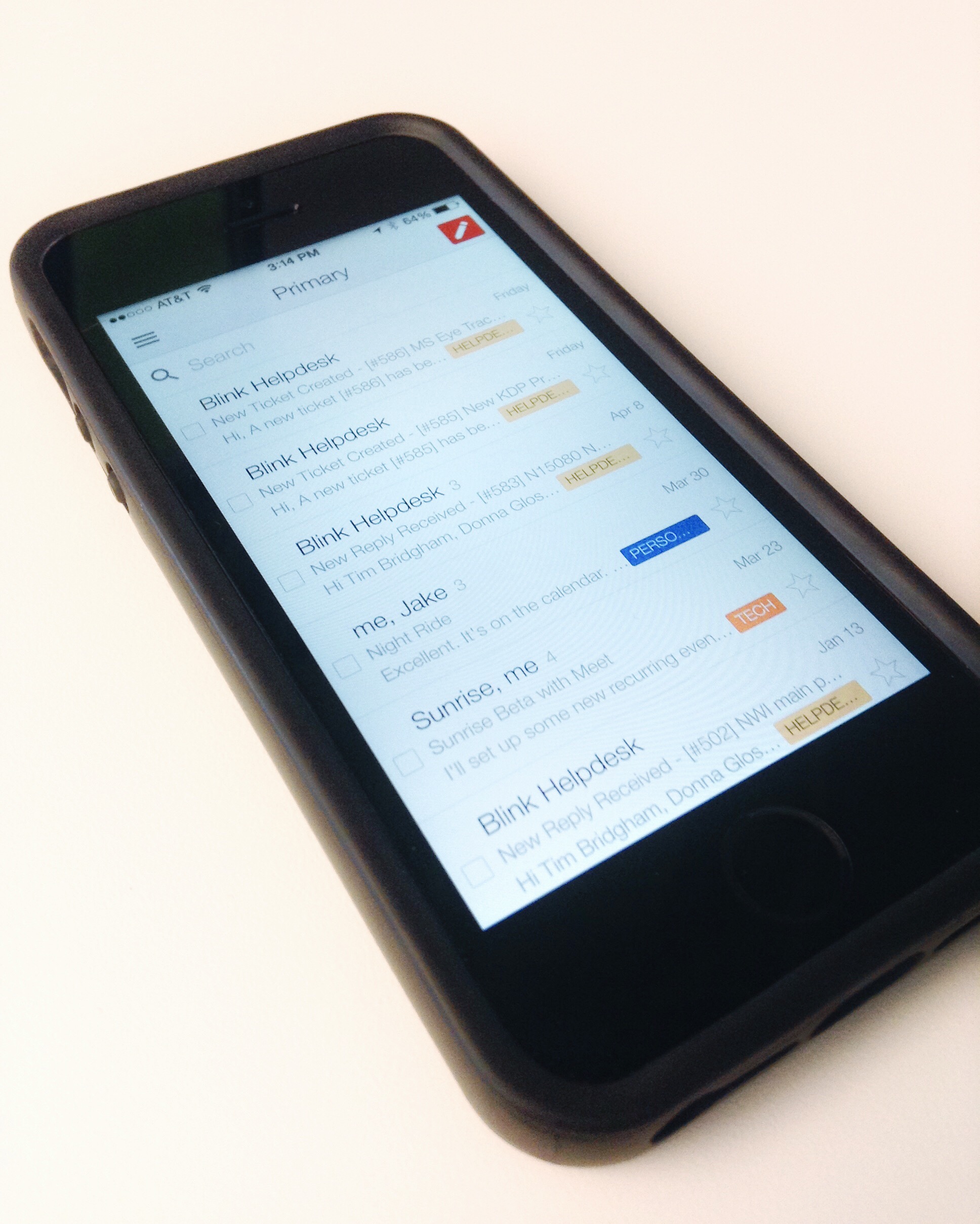
For several years while using my iPhone I found many pain points (lack of label and a very slow search to name a few) using the built-in Mail app to access my email. While I was able to use the basic functions of Mail, I was missing all the added features (again, labels and more recently, inbox categories) and the overall look and feel I was accustomed to in Gmail. In late 2011 Gmail came to iOS and brought its familiar look and feel as well of many of its best features. I made the move to the Gmail app about 18 months ago and I’d recommend the same move to every Gmail user. Again, it will help improve user efficiency and eliminate the need to learn multiple systems.

The similar design an interactions of Gmail's web app and iOS app allow for easy transition between devices. 

These two examples of designing good experiences that transition between devices show that technology can be a benefit and not a hindrance to users. I know many more examples of universal user experience exist and I’m always on the lookout for more. Have you seen examples of universal user experience? Leave a comment or email me at uxpursuit@gmail.com.


EVERYDAY UX: INTRODUCTION

As a part of documenting my pursuit of a UX career I’ll be sharing posts I call “Everyday UX”. These posts will highlight everyday user experiences that I encounter. I hope to showcase many different forms of UX. I hope to focus on both good and bad UX and to try to examine what can make the bad ones better.  

If you see examples of either good or bad user experiences please leave a comment below or email me at uxpursuit@gmail.com.

Come back next week to read my first Everyday UX post. I’ll be featuring two great tools that demonstrate great “universal” user experiences. In the meantime you can also check out the newest page on the UX PURSUIT, Great UX. It’s my curated library of all kinds of great experiences.