Two weeks ago I attended a user experience conference in Seattle called Convey UX. I was able to attend a few workshops and hear several talks led by UX practitioners from around the globe.
There were three key insights I took away from Convey UX:

Jakob Nielsen
I have recognized the first idea over the past two and a half years while working at a UX firm assisting and observing researchers and designers. There are so many methods and techniques used in UX research and design, many of which were discussed at the conference, but they all should point to the second idea Mr. Nielsen states: it’s not about technology, it’s about humans.
The understanding that it’s all about humans has been a constant thought as I’ve been working, learning, training, and just living my life. It makes so much sense that we must first determine the human’s needs and then design the technology (or product) around those needs. Have the technology solve the need, don’t make the human conform to the technology.

Michael Beasley
One aspect of UX that has been growing in importance recently is analytics. I’ve only just scratched the surface of Google Analytics on this site so when I saw a workshop called “Web Analytics for User Experience” I jumped at the chance learn more. Michael Beasley presented the workshop and led us through the basics of what a powerful tool like Google Analytics can do. Beasley explained how analytics can help us understand why people come to a site, what people do while on that site, and how it can measure the effects of design change. To be clear, Beasley wasn’t advocating that UX researchers and designers live and die by the quantitative data that analytics provides. He readily admitted that analytics can’t answer the question of “why” a user does something but the quantitative data from analytics can give us clues as to why and provide us with more evidence to help guide our design decisions.
Based on what I learned from Beasley’s workshop, I’ve looked at the quantitative data on this site and I can already see clues as to where my site could use some tweaking. For instance, in the last month I have a bounce rate of almost 96%. A bounce is when a user enters a site on a specific page and then leaves the site without going to another page or interacting with anything else on the site. Bounce rate is just the percentage of pageviews that are bounces. Seeing this high number (96%) and understanding what it was calculating has given me some clues as to how I can change my site to reduce my bounce rate. Because the home page of this site is my blog and because each blog post is shown in its entirety a visitor can essentially view all the content on this site except the few other pages I have (A UX Pursuit, About, and Great UX). If I want people to view more pages on this site then I should have each blog post show a preview of the content and then make them click a “read more” link to see the entire post. This would also give me a better sense of the posts visitors are reading most.
Nathan Shedroff
Another workshop that caught my eye was Nathan Shedroff’s “Redefining the Value of Experience.” One goal of the workshop, namely learning “a new definition of value that expands the discussion and value for UX” aligned with some thoughts I’ve had around the importance of customer research to deliver great customer experiences. Additionally, I thought this would provide a good balance to the web analytics workshop I attended.
Shedroff’s key point was that we need to change our traditional ideas of value. Most commonly value, for a customer, is only defined as being monetary and functional (price and features). Instead he proposed that there are five kinds of value:

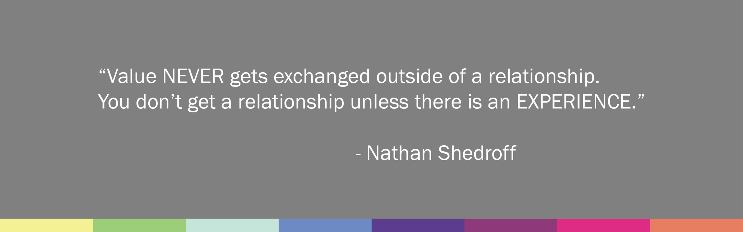
Shedroff expanded on the two traditional quantitative values and added the three qualitative values of emotion, identity, and meaning. He also emphasized that all these values are never exchanged outside of a relationship! And equally important, you can’t create a relationship unless there is an experience!

Shedroff broke down these five values further by looking at their level of importance, from most shallow to deepest:

- Function = Easy to talk about, usually quantifiable.
- Price = What am I willing to pay? Quantitative.
- Emotion = How does it make you feel? Much more valuable than functional/financial, not quantifiable, often subconscious.
- Identity = Is this me? Customer needs to see themselves in the product/brand.
- Meaning = Does this fit into my world?
According to Shedroff, it becomes imperative to create great experiences in order to build relationships so value can be exchanged. And when we make meaningful connections through well-designed experiences it creates the deepest relationships possible. (I would add that it creates loyal customers who help build more relationships in support of the product/brand.)
To distinguish these five values a bit further, Shedroff separated them into either quantitative or qualitative.
Quantitative = [functional & financial] this is where traditional business tools focus.
Qualitative = [emotional & identity & meaningful] = invisible to most business people. This is what needs to be designed and valued.

Shedroff explained that we shouldn’t ignore the quantitative values; in fact, he said that quantitative values are very important but they don’t tell the whole story. It’s the qualitative values that are seen as the premium values that distinguish products or companies.
Shedroff summed it all up when he said, “Those companies who focus on premium value create more of it, more often.”
As I talked about in one my earliest posts, I care about people. I care about building lasting relationships with the people in my life and I go about building these relationships by getting to know people and sharing experiences together. This practice, as Shedroff points out, could be easily applied to UX research and design. By starting with this practice in mind you lay a solid foundation for what the customer truly wants and desires. Not only do you know where to price your product/app/service/etc., and what features it should have, you understand what will help build lasting connections to your customers because you understand that all the values that are important. Then by repeating this process throughout design, development, launch, and even after launch you are only creating more value.
I learned a few great concepts at the conference and I’m excited to put them to practical use. I’ve actually got a few projects that I hope will take off soon so keep an eye out for those. In the meantime, if you have feedback on this site I’d love to hear from you. Please feel free to leave a comment below or email me at uxpursuit@gmail.com.