THE CUSTOMER IS ALWAYS RIGHT or THEY CAN TEACH YOU WHAT IS RIGHT

Growing up I remember seeing a wooden plaque on my dad’s desk that read something like, “Rule #1 The customer is always right. Rule #2 If the customer is wrong, refer to Rule #1.” This is the crucial starting point for designing great experiences. 

Products, services, or experiences must be designed with the customer's needs as an essential part of the design process. IDEO is a design firm that takes on this “human-centered, design-based approach.”

Human-centered design process outlined by IDEO.

In his blog post for User Testing, Spencer Lanoue outlines the two key empathetic methods IDEO uses to discover the end user’s needs during the inspiration phase.

  • Observing user behavior — Try to understand people through observing them. For example, if you’re designing a vacuum cleaner, watch people vacuum.
  • Putting yourself in the situation of the end-user — IDEO does this to understand what the user experience is really like; to feel what their users feel.

Many have lost site of this principle and are losing customers to companies who are designing with the user in mind. Sunrise, a calendar app started with this in mind when they set out to “solve some of the problems with calendars they heard from users”:

1. “Today’s calendar feels quite stale”
2. “My calendar takes forever to synchronize properly”
3. “Timezone support is a pain”

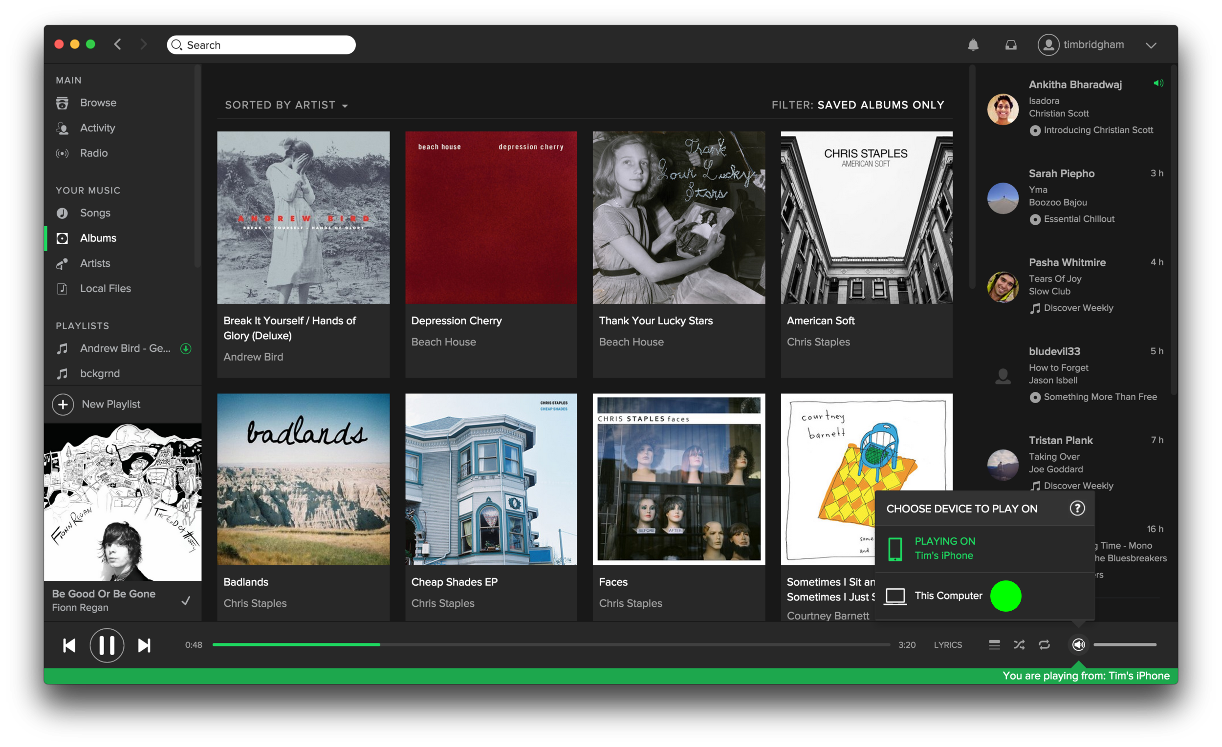
Dissatisfied with the stock Apple Calendar app I sought out a calendar app that would solve the problems I was encountering. Sunrise was the solution. After reaching out to Sunrise with a few improvements I thought could further enhance their app they invited me to their beta program and sought my feedback. Additionally, I participated in a one-on-one interview with one of Sunrise’s product managers who's desire was to know more about how I used the app and its services. And lastly, I was invited to participate in a secret project for a feature so new it wasn’t even in the beta app. 

A quick comparison between apps. Both a "days" view and "items" view split but Apple only show events for the date selected. Sunrise shows just two weeks of the "days" view to prioritize the events, not only of the date selected, but also for the following several days. Additionally, Sunrise adds pops of color and icons, which correlate to the type of event, to make the calendar less stale. 

Sunrise took the time and made the effort to discover and understand its user’s needs. 

In February of 2015 Microsoft acquired Sunrise and in October of 2015 Microsoft officially shut down the Sunrise app. When I reached out to my contact regarding the shutdown she told me “the team has moved on to revamp the Outlook app for iOS and Android.” Additionally, in their farewell post the Sunrise team promised: “We won’t stop innovating. While building Sunrise, we were always learning from and listening to you to come up with ways to delight you and make you more productive.” 

Remember, the customer is always right or listen, observe, and empathize and they can teach you what is right

A SLIGHT CHANGE AND A NEW FOCUS FOR UXPURSUIT.COM

It’s been a little over a year since UX Pursuit launched. In that time I’ve created over fifteen unique posts with many more in the works, designed some simple branding, and most importantly learned a considerable amount relevant to my UX pursuit.

One tangible insight relates back to my previous post and comes from what I learned around Google Analytics. As I mentioned, my site has a higher bounce rate and that is due in part to the way the information is laid out. Knowing that, I’ve changed the template of my Squarespace built website to make my recent blog posts more accessible. Now, as you can see, recent posts are displayed to the right giving readers a better sense of the other content they can access. So if you haven’t explored other post yet, please do so.

The other major takeaway applies to a new aim in my pursuit; to develop what I've learned so far by doing practical UX research and design work. I’m currently in the midst of a website redesign project and seeking another exciting project. The biggest way for me to develop my skills is to practice them so if you would like to collaborate on a project or know someone who might please get in touch.

uxpursuit@gmail.com

TRAINING: KEY INSIGHTS FROM CONVEY UX

Two weeks ago I attended a user experience conference in Seattle called Convey UX. I was able to attend a few workshops and hear several talks led by UX practitioners from around the globe.

There were three key insights I took away from Convey UX:

Jakob Nielsen

I have recognized the first idea over the past two and a half years while working at a UX firm assisting and observing researchers and designers. There are so many methods and techniques used in UX research and design, many of which were discussed at the conference, but they all should point to the second idea Mr. Nielsen states: it’s not about technology, it’s about humans.

The understanding that it’s all about humans has been a constant thought as I’ve been working, learning, training, and just living my life. It makes so much sense that we must first determine the human’s needs and then design the technology (or product) around those needs. Have the technology solve the need, don’t make the human conform to the technology.

Michael Beasley

One aspect of UX that has been growing in importance recently is analytics. I’ve only just scratched the surface of Google Analytics on this site so when I saw a workshop called “Web Analytics for User Experience” I jumped at the chance learn more. Michael Beasley presented the workshop and led us through the basics of what a powerful tool like Google Analytics can do. Beasley explained how analytics can help us understand why people come to a site, what people do while on that site, and how it can measure the effects of design change. To be clear, Beasley wasn’t advocating that UX researchers and designers live and die by the quantitative data that analytics provides. He readily admitted that analytics can’t answer the question of “why” a user does something but the quantitative data from analytics can give us clues as to why and provide us with more evidence to help guide our design decisions.

Based on  what I learned from Beasley’s workshop, I’ve looked at the quantitative data on this site and I can already see clues as to where my site could use some tweaking. For instance, in the last month I have a bounce rate of almost 96%. A bounce is when a user enters a site on a specific page and then leaves the site without going to another page or interacting with anything else on the site. Bounce rate is just the percentage of pageviews that are bounces. Seeing this high number (96%) and understanding what it was calculating has given me some clues as to how I can change my site to reduce my bounce rate. Because the home page of this site is my blog and because each blog post is shown in its entirety a visitor can essentially view all the content on this site except the few other pages I have (A UX Pursuit, About, and Great UX). If I want people to view more pages on this site then I should have each blog post show a preview of the content and then make them click a “read more” link to see the entire post. This would also give me a better sense of the posts visitors are reading most.  

Nathan Shedroff

Another workshop that caught my eye was Nathan Shedroff’s “Redefining the Value of Experience.” One goal of the workshop, namely learning “a new definition of value that expands the discussion and value for UX” aligned with some thoughts I’ve had around the importance of customer research to deliver great customer experiences. Additionally, I thought this would provide a good balance to the web analytics workshop I attended.

Shedroff’s key point was that we need to change our traditional ideas of value. Most commonly value, for a customer, is only defined as being monetary and functional (price and features). Instead he proposed that there are five kinds of value:

5values.png

Shedroff expanded on the two traditional quantitative values and added the three qualitative values of emotion, identity, and meaning. He also emphasized that all these values are never exchanged outside of a relationship! And equally important, you can’t create a relationship unless there is an experience!

Shedroff broke down these five values further by looking at their level of importance, from most shallow to deepest:

layers.png
  • Function = Easy to talk about, usually quantifiable.
  • Price = What am I willing to pay? Quantitative.
  • Emotion = How does it make you feel? Much more valuable than functional/financial, not quantifiable, often subconscious.
  • Identity = Is this me? Customer needs to see themselves in the product/brand.
  • Meaning = Does this fit into my world?

According to Shedroff, it becomes imperative to create great experiences in order to build relationships so value can be exchanged. And when we make meaningful connections through well-designed experiences it creates the deepest relationships possible. (I would add that it creates loyal customers who help build more relationships in support of the product/brand.)

To distinguish these five values a bit further, Shedroff separated them into either quantitative or qualitative.

Quantitative = [functional & financial] this is where traditional business tools focus.

Qualitative  = [emotional & identity & meaningful] = invisible to most business people. This is what needs to be designed and valued.

Shedroff explained that we shouldn’t ignore the quantitative values; in fact, he said that quantitative values are very important but they don’t tell the whole story. It’s the qualitative values that are seen as the premium values that distinguish products or companies.  

Shedroff summed it all up when he said, “Those companies who focus on premium value create more of it, more often.”

As I talked about in one my earliest posts, I care about people. I care about building lasting relationships with the people in my life and I go about building these relationships by getting to know people and sharing experiences together. This practice, as Shedroff points out, could be easily applied to UX research and design. By starting with this practice in mind you lay a solid foundation for what the customer truly wants and desires. Not only do you know where to price your product/app/service/etc., and what features it should have, you understand what will help build lasting connections to your customers because you understand that all the values that are important. Then by repeating this process throughout design, development, launch, and even after launch you are only creating more value.

I learned a few great concepts at the conference and I’m excited to put them to practical use. I’ve actually got a few projects that I hope will take off soon so keep an eye out for those. In the meantime, if you have feedback on this site I’d love to hear from you. Please feel free to leave a comment below or email me at uxpursuit@gmail.com.


*Photos by Mark Gsellman and slides taken from Nathan Shedroff’s SlideShare site.

TRAINING: A CONVERSATION WITH SARAH NAGLE

“User experience; it’s every day.”

Last year I had the privilege to sit down and talk UX with Sarah Nagle, the Senior Manager for Design Insights at REI. Sarah helped launch a team at REI that engages with either existing or targeted customers to gain insights that contribute to the design choices behind what REI is making. She and her team strive to go out into the field; to go to people’s homes, go backpacking with them, go camping with them, sit around the fire with them to really “understand how they use products and how REI can make them better.”

Sarah Nagle, Senior Manager for Design Insights at REI

Sarah Nagle, Senior Manager for Design Insights at REI

One fairly recent project Sarah and her team assisted with was the launch of the new REI line evrgrn. Evrgrn launched “with a new generation of outdoor enthusiasts in mind, people who experience nature in a variety of environments, from woodsy campgrounds to less traditional ‘outdoor’ venues, like music festivals and backyard barbecues.” Sarah explained to me that the team went out, long before any products were made, to interact with this new customer to understand the different ways they “camp.” With the insights they gained they set out to make great products that produce great experiences. You can read more about the launch of evrgrn here.

One goal I had in chatting with Sarah was to learn more about design insights, a field that is growing in interest to me. The other goal was to create an audio story as part of my education. Sarah and talked for about 35 minutes and I created a short (just over) 2 minute audio piece reminiscent of a something you might hear on NPR.  

One of the biggest takeaway from our conversation was Sarah explaining a key philosophy behind how REI creates products. “We have these expectations around how people do certain things but you can’t build products around expectations or what we think. We need to go out and talk to people.” 

--UPDATE--

In March the Seattle Times did a showcase of Sarah as a part of their Cool Jobs series. You can read the article here.

EVERYDAY UX: USING SPOTIFY

Last summer Apple introduced its streaming music service Apple Music and, for me at least, it initiated the final push over to streaming music. My wife had already jumped on the Spotify bandwagon but I felt like giving Apple Music a try especially since they had a 3-month free trial. While Apple Music had it’s nice features in the end I chose to join Spotify because of its social features like seeing what your friends are listening to and creating public (and private) playlists.

connected devices 1 (mobile).PNG

In my first four months of using Spotify I’ve enjoyed some great features and experienced a few pain points. I’ll highlight a few and I’d love to hear about your experiences as well so leave a comment after you’re done reading.

First, the good. Spotify’s ability to connect to other devices has been nothing short of amazing. I have seen iTunes talk to my Apple TV but Spotify’s seamless connection between my phone, desktop application, and Apple TV is superb.

While playing a song in Spotify on my iPhone the desktop app shows me that I’m currently playing music from my phone and even gives real-time feedback as to where I am in the song. I can easily switch to playing the song from my computer with a few clicks on my computer and a few taps on my phone. The process is simple, straightforward, and perfect for controlling the music in the living from from your kitchen.

Second, the not-so-good. Spotify has many ways to enjoy the over 30 million songs it has. You can search for a specific song, artist, album, playlist, and more. Or you can browse curated playlists, the latest charts, new releases, and even more. There’s even a radio feature similar to Pandora. And lastly, you can manage your own library of saved playlists, songs, albums, artists, and still more. With all these great ways to experience content it is crucial that the information architecture or layout of each of these sections be optimal.

Current presentation of all music when selecting an artist to view.

Current presentation of all music when selecting an artist to view.

This is where I have an issue, particularly in the “Your Library” section. When I want to play an album, say the Spotify Sessions by Mutual Benefit, I have two ways in which I can get the album. The first would be to tap on the “Albums” section but then I am presented with a list of all the albums I’ve saved to my library (which can be sorted by artist or by album title). I’m then forced to scroll down to find the Spotify Sessions album I want to play. Secondly, I can tap on the “Artist” section and then tap on the artist Mutual Benefit but then I am presented with just a list of all the songs I’ve saved to my library. The songs are displayed in track order by album but there is no clear distinction between the end of one album and the start of the next. To make the process of selecting a specific album easier Spotify should present a list of the artist’s albums after you’ve selected a specific artist. This simple flow below illustrates the better experience I’ve proposed.

1. Tap Artists and present all artists saved to my library. 2. Tap Mutual Benefit and present all albums by Mutual Benefit saved to my library. 3. Tap Spotify Sessions and present the songs from that album (4).

Lastly, one (probably large) fix that could enhance Spotify for a small minority of users. According to the Pew Research Center, as of September 2014, 71% of online adults use Facebook so I know I’m in the minority as a young adult without a Facebook account. Because Spotify is highly integrated with Facebook this presents some headaches when using Spotify. Firstly, and more importantly, if a friend wants to follow me on Spotify they have to know my specific username and type the following in the search bar: “spotify:user:username” to find me. This hinders the social aspect that distinguishes Spotify from other streaming services. Secondly, and somewhat related, Spotify users whose accounts are not connected to Facebook cannot update their profile picture. This isn’t going to prevent me from using Spotify but more of a “nice feature to have.”

This has been my experience using Spotify and I know they come as a result of how I use the service. What has been your experience, either good or bad? Please leave a comment below.

EDUCATION: CREATING A LOGO

UX Pursuit Logo

UX Pursuit Logo

For the next unit in my communications course our goal was to design a logo that illustrates and brands our topic, or in my case, this site. In setting out to create my logo I knew I wanted simple lines, minimal colors, and basic shapes. I also knew I wanted to try to express two main ideas.

The first is the idea of ‘finding my way’ or a sense of pursuit toward a user experience career. The second idea was to express a sense of the broad spectrum that is user experience. Lately, as I mentioned in a recent post,  in my pursuit of a UX career I’ve discovered UX involves more than just web/mobile design. It “encompasses all aspects of the end-user’s interaction with the company, its services, and its products”. Again, the spectrum graphic developed by Information Architects, Inc. does a great job of illustrating the wide scope of user experience and served as some inspiration for my logo.

Draft:

In my first draft, for the pursuit theme, I tried to find a symbol that meant searching and the symbol that made the most sense was a magnifying glass. Following the simple lines motif I created a simple magnifying glass. I didn’t want the object to be too literal. I wanted a simple outline or something similar to the figure/ground technique. To try to convey the overlapping and broad spectrum of user experience I played with overlapping circles and colors.

Combining the two I wanted to achieve a sense that the magnifying glass is finding UX among the many colors. This is the same sense that I was trying to convey in my graphic collage. To make the logo pop a bit I added the blend technique to the magnifying glass and gave the three circles a drop shadow effect. Additionally I played with rotating the the circles and magnifying glass about thirty degrees to give some visual interest.

First draft.

First draft.

After I completed my first draft I was pretty pleased with the design.

Feedback:

After reviewing feedback I received from my classmate and taking a second look at my logo a few things stood out that I knew I needed to address. The first was simplifying the logo. The shading effect I tried to create and the drop shadow on the circles needed to be removed. Additionally, I saw that the logo need more of an enclosed feel. The first draft felt like it could all just wash away.

Revisions and Tweaks:

The first step I took to refine the logo was enclosing my it inside a hexagon shape and removing the shading and shadows. I still felt like circles of colors seemed disjointed or floating. I attempted to add a 4th circle but still wasn’t happy with what I had. I kept coming back to the ‘spectrum of ux’ graphic and some of the enclosed colors stood out to me. I decided to divide up the hexagon shape into equal pie like slices and I colored them in with the colors that inspired me from the graphic. At this point it was clear that I was on the right track. One final tweak of shifting the center of the ‘pie shapes’ to the center of the magnifying glass and it was perfect. Lastly I added in the letters ‘UX’ inside the magnifying glass and my logo was done.

In creating my logo I was very happy to see the progress I had gone through to get the final result that I did. I enjoyed ideation process of creating, assessing, tweaking, and then repeating those steps as many times as necessary. Since I developed the main logo I’ve gone back I played around with an alternative letter logo that I can use in other ways. At first I copied the magnifying glass shape out of the main logo and tweaked it to replace the “P” in pursuit. Again, after I stepped back, assessed the design, and got great feedback from my wife I adjusted the my original idea (we realized the magnifying glass looked more like a “q” then a “p”).

Alternative letter logo.

Alternative letter logo.

Here’s a look at my process from start to finish.

I'd love to hear your feedback on the logos I made. Please let me know what you think. Thanks

USING DATA TO DRIVE CHANGE (ONE CYCLIST AT A TIME)

Last week I volunteered part of my day to the 2015 Bike/Pedestrian Count as a part of the Washington State Bicycle and Pedestrian Documentation Project. I chose to spend my time counting cyclists and pedestrians for two main reasons. Firstly, as a bike commuter, I want to see continued improvements made for non-traditional commuters in a city where congestion and traffic seems to be getting worse and worse. And secondly, I can get behind the approach in which WSDOT and the Cascade Bicycle Club are using to drive change: through the collection of data.

Sunrise at the intersection of the Duwamish Trail and the W. Seattle Bridge Trail.

Sunrise at the intersection of the Duwamish Trail and the W. Seattle Bridge Trail.

When I moved from Kansas City to Seattle just over two years ago it was clear to me that Seattle is a much more bike friendly town than Kansas City. This is partly due to the temperate climate of Seattle but, more importantly, it is due to political support and the work of organizations like the Cascade Bicycle Club to make Seattle a more 'bikeable' city through the Seattle Bicycle Master Plan. Commuting to work on my bicycle seemed like the obvious choice especially when my office provides bike storage and locker rooms. In 2014 I rode nearly 1120 miles on my bike and this year I’ve already surpassed that number.

When I learned that volunteers were needed to count cyclists as a part of the effort to make Seattle more 'bikeable' I knew I wanted to help. I was especially excited to learn more about why we would be counting commuters at key locations throughout the city. The Washington State Bicycle and Pedestrian Documentation Project is “an annual bicycle and pedestrian count taken at locations throughout Washington State in nearly 50 jurisdictions. Data collected from these counts will be used to monitor success in increasing bicycle and pedestrian travel as identified in the Washington State Bicycle Facilities and Pedestrian Walkways Plan while also providing critical data to support improvements to bicycle and pedestrian facilities.”

The key part of this project is that “counting bicyclists and pedestrians at specific locations will help us to more accurately estimate demand, measure the benefits of investments, and design our projects. This information will also help us target safety and mobility projects and improve our traffic models.”

I see the positive way in which data can drive good decision making everyday at the user experience firm where I work. Our goal is that the user research we do informs the designs we produce. I too feel that important decisions, including how to make Seattle more "bikeable", should be made with good supporting data. This concept, 'data-driven-decisions', is standing out as a key component to creating great user experiences. 

I hope the information I collected helps to make improvements for the fellow commuters in my neighborhood. So how are things looking?

Here are the numbers for the morning commute at the intersection where I counted since 2009:

2009 - 139 | 2010 - 123 | 2011 - 289 | 2012 - 258 | 2013 - 233 | 2014 - 315 | 2015 - 308

Cyclist counted at the intersection of the Duwamish Trail and the W. Seattle Bridge Trail from 2009 to 2015.

Cyclist counted at the intersection of the Duwamish Trail and the W. Seattle Bridge Trail from 2009 to 2015.

At least for my intersection, it looks like the numbers overall are trending up but I’ll leave it to the Washington State Bicycle and Pedestrian Documentation Project folks to really crunch the numbers.

Bike commuting back in May 2014. 

Bike commuting back in May 2014. 

#bikeseattle